I have been working through some small transformer training runs, and one of them produced a pattern I had read about but never actually watched happen. It seemed worth writing down while it was still fresh, mostly as notes to myself.
The starting point was Andrej Karpathy’s ng-video-lecture repo, the code from his Let’s build GPT: from scratch, in code, spelled out lecture.
Training loss measures how well a model fits data it has already seen. Validation loss measures how it does on text it has not. While a model is picking up structure that seems to generalize, both tend to fall together.
The part I found interesting is what happens when they stop moving together. If training loss keeps dropping while validation loss turns around and climbs, it looks like the extra progress is going into memorizing the training split rather than into something that transfers. This is what overfitting looks like, and I think it is one of the reasons for keeping a validation split around in the first place, the other being hyperparameter tuning. Watching only the training curve, that stretch still looks like improvement, which is probably part of why it is easy to miss.
What I changed
I was training a character-level GPT on the Folger Shakespeare corpus, the full 42-work set rather than the smaller Tiny Shakespeare file the lecture uses, and changed one thing: the number of transformer blocks, going from 6 up to 12. Corpus, batch size, learning rate, and the 12,500 step schedule all stayed the same. I mostly wanted to see what more depth would do on a fixed budget, and I half expected it to just be better.
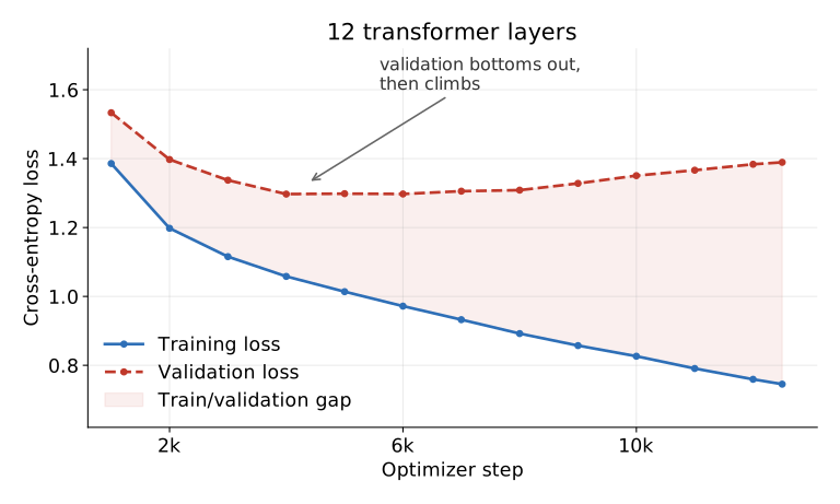
Validation loss reached its lowest point, about 1.2971, around step 4,000. From there it climbed to 1.3893 by the end of the run, while training loss carried on down to 0.7453. The gap between them widened to 0.64. The curves alone cannot tell me what the extra capacity was actually spent on, but a good chunk of the run clearly went into getting better on training data while slowly getting worse on held out data.
The shallower run, for comparison
The 6-layer version turned out to be a useful reference point, since it does not make that turn.
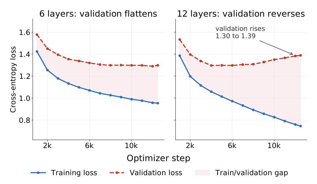
Its validation loss settles near 1.30 and stays there, finishing at 1.2986 with a gap of 0.35. A flat validation curve alongside a fairly steady gap felt like a different situation to me, maybe a model that has learned most of what this particular data has to offer. Where exactly you draw the line between the two cases still seems like a judgement call to me.
One detail I keep turning over: the 6-layer run’s final validation loss, 1.2986, is basically the same as the best the 12-layer run ever managed, 1.2971. So the deeper model may not have been worse at its best moment so much as unable to stay there.
I should say this is a single pair of runs and not a careful study. Building a different number of blocks shifts the random number stream, so the two runs saw the same sampling procedure but not identical minibatches. The divergence in the 12-layer run is large compared to the step-to-step wobble in the curve, so I doubt it is noise, but I would not want to lean on small differences from an experiment set up this loosely.
What I have started doing
Probably not the only reasonable approach. I have mostly just started plotting both losses on the same axes early rather than checking at the end, since the shape of the pair seems to say more than either curve alone. Roughly what I think I am seeing:
- Both falling: probably still learning something that generalizes.
- Validation flat while training drifts down: maybe diminishing returns, with the gap holding steady.
- Validation rising while training falls: possibly the point where added capacity is going into memorization.
These are rough heuristics rather than anything crisp. There are other angles I have not tried yet and should, like holding on to the best-validation weights instead of the final ones, stopping early, adding regularization, or actually reading the generated samples at different points in the run to see whether the loss numbers match what the text looks like. Any of those might tell a different or more complete story than the curves do.
The thing that stuck with me is that the lowest training loss across these runs came from the model that generalized worst. That seems obvious once written down, but it was not what I expected going in, and I think I would have missed it if I had only been watching one curve.
Full numbers, configuration, and artifacts are in the training report.